One of my continual frustrations when visiting both college and corporate newspaper websites is the lack of creativity and design in regard to the category pages. Many sites (the Whitman Pioneer’s included) simply list the articles one after another with no real thought to what that category might need that’s different from others. While this might work great for a personal blog a site with as much content as a newspaper needs something decidedly different.
How do we fix this?
With the focus on moving newspapers both large and small to a more web-first mindset there has been a lot of noise about ditching the traditional print mindset. While this may hold valid for many things I think that there’s an element of print that is useful for thinking about category pages online.
When you open up a print newspaper you expect to have different sections that all look a little bit different. The Sports page might have a columnist on the front page while the Arts section may have more photos, illustrations, and reviews; this is the kind of thinking that needs to translate onto the web.
By incorporating a variety of aspects onto certain category pages newspapers ought to be able to incorporate a more mixed method of delivering content. Furthermore, by allowing for flexibility in terms of what’s displayed newspapers would have the ability to add certain aspects to a category page that might not be relevant to others. This would allow not only for more relevant content, but also for the ability to draw attention to things you might be charging for: that live blog and chat of the local sports team’s away game for example.
Where do we look?
This all sounds fine and good, but since so many newspapers (particularly college papers) use a standard category page it can be hard to find good examples. While the New York Times is not the perfect website by any means I think that their category pages are particularly good.
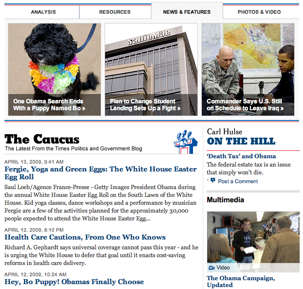
For example, their Politics and Government page is amazing. This has a good mix of traditional headlines and excerpts with photos, multimedia, and more. The top of the page has a heavy focus on photography. Then, the rest of the page is filled with a mixture of headlines, multimedia, interactive graphics, and podcasts. Were the NY Times to start charging for certain aspects of their multimedia this kind of a page would give them a great ability to draw attention to special features.
This is what I’m trying to do with News Evolved. By creating a simple grid for the site I’ve been able to have a lot of flexibility with category pages. To see a couple examples check out the Journalism landing page and the Politics page. Anyway, these are just my ideas and are probably a little rough and ineloquent. I’d love to hear what you out there think. Are different category pages ideal, or is a unified experience for the user preferred? Sound off in the comments.
Comments
Andrew, I think you make an excellent point. By varying up the layouts and pieces of content on different category pages, you give the reader a reason to peruse the category more thoroughly than if they just saw the same type of listing over and over.
This is something that we’ve done at http://www.yaledailynews.com to pretty good effect (in my opinion). Each of our top-level section pages (News, Sports, Opinion, Scene, etc.) have different layouts to emphasize different things. The Opinion section features a comic front and center; our Scene section (arts/entertainment/living) features our reviews prominently; our Sports section shows all the sports for the current season and syndication of outside sites.
I look forward to seeing what you come up with for News Evolved. I think there is a ton of room for experimentation in this space.
[…] organization or a magazine you tend to find one thing in common: homogenous category landing pages. I wanted to move as far away from this model of a WordPress theme as I […]