Catherine Winters had the second session in the afternoon UX track. She talked about how to expand our conception of what a WordPress site is.
“Oftentimes many of us can tell, at a glance, when a site is using WordPress.” It’s the ones that surprise us that make things interesting. What is good for a blog is not necessarily best for other sites.
The assumption is that people making websites already know what they’re doing. This isn’t necessarily true. Elements taken as a given on a blog (sidebar archives, blogroll, etc.) should be reconsidered. Many times they aren’t necessary to the overall functioning of the design.
Catherine argues that we should try to limit things in sites that are necessary to the site itself. By doing this we’ll be able to avoid what Jakob Nielsen refers to as banner blindness.
She points out that “The blog post is the pitch.” The content of a site is what people will stick around for. Badges and widgets in the sidebar distract from this central purpose.
Similarly, page navigation and forcing users to click-through to see full content only creates a drop in the percentage of users who do stick around to read things.

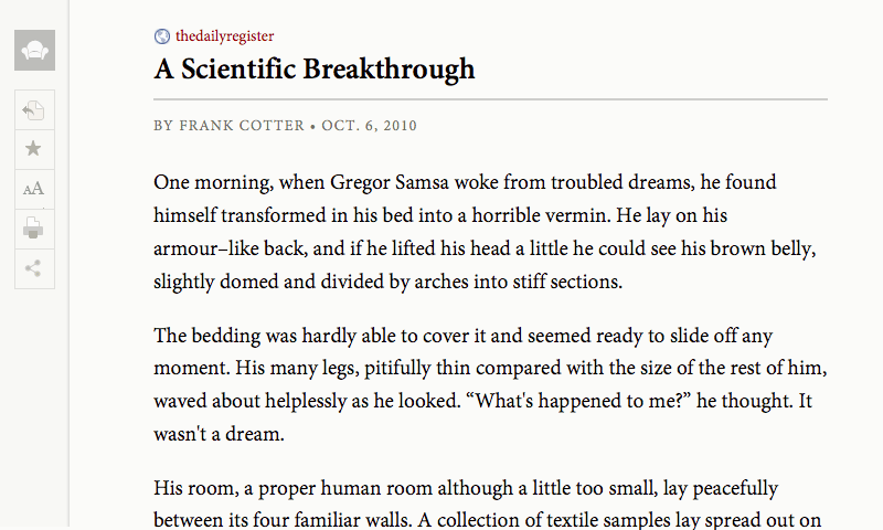
Looking to the design of apps like Readability or Instapaper that are centered around reading can serve as effective guides for sites. She also pointed to Dustin Curtis and Jason Santa Maria as examples of effective content design and direction.
Others, like the ADDitude site that Catherine mentioned are examples of all the things to avoid. 9 column grids with busy design that provides no sense of hierarchy just overwhelm us.
wp-Typography was also mentioned as a way to align a site with basic typographical principles. This provides some basic tools for hyphenation, bullets, and other typographical tools.