A few days ago the New York Times posted a piece about a news startup that is garnering some attention for its business model. The company is Global Post and they’re aiming to make global news coverage profitable again by somewhat changing the revenue model.
With 65 correspondents worldwide who make $1000 a month for 4 stories finding the funding for that kind of operation might seem daunting, but it appears as though they’re succeeding (at least in the short term). Traffic to the site is well ahead of the founders’ expectations and they’re acquiring a decent list of paid subscribers.
These paid subscriptions are the crux of the revenue model. Global Post offers a service they call Passport which “offers access to GlobalPost correspondents, including exclusive reports on business topics of less interest to general audiences, conference calls and meetings with reporters, and breaking news e-mail messages from those journalists.” They even allow Passport members to essentially become a part of the editorial staff by suggesting story ideas.
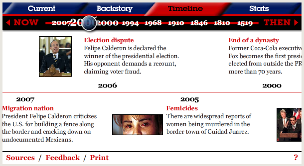
Their website also has some interesting features (as well as some serious failings…more on those in a bit). Below some of the featured articles they’ve compiled Timelines, stats, and more about the topic of the piece. While it’s too bad that these info boxes aren’t more apparent and higher up in the article they’re still a nice touch.
However, as much as the Global Post is trying to create a new business model, they are still doing it without breaking the mold of online news. Their homepage is a cluttered mess that tries to convey some information about far too many subjects. This results in a page where one must scroll more than half the way down before finding a section of Global Blogs, 3 of the main content sections, and the multimedia section.
If a homepage is going to serve as a place to draw traffic into the site (as some have suggested) then most of that content needs to be apparent at first glance. As it is the homepage shows 2 ads, a small navigation bar, the search bar, and 2 featured stories.
By designing the homepage for wider screens and scaling down the size of the featured images and ads Global Post would be able to fit more actual content into that first screen. I would be much more inclined to actually use the homepage itself instead of RSS feeds if information was presented in a clear and immediately understandable way. As it is none of the headlines have dates next to them and it seems as though it would be very difficult to track what articles are new content.
While it may provide some interesting aspects of a business model the Global Post ultimately did not create a online home that innovates. It will be interesting to see how the organization does in the coming months/years in terms of profit, but I cannot see it succeeding without a seriously redesigned homepage.
Comments
I think this is the Global Post, but I really like the idea of upselling all of the content around the article. For instance, you get the podcast for free, but you can pay to get the full audio to put to your own uses.